
Explore "Week #4 Key It" from other projects

Cheap Smokes

Fat Ass

Cleaning Windows

homegrown

Phoning It In

Nuts and Bolts

Jaguars

The Guac Bloc

Blank Verse: A Midsummer Night's Dream

Dear Stella

The Hill

Goons

Blackwater Music

North of Normal

Sessions with Dr. Love

Sum: 1, 2, Love

Killing It

Maple U

Brainstorming

Sasquatchulookinat?

The Pitch

'Ganza

Graham Clark: Wilderness Man

We See Thee Rise

Hindsight

Hollywood North

Shirts

Buddy Guys

The Crimson Wave

The Undrawn
Explore
more

A sexual health nurse with a tactless moral compass, uses online dating to avoid falling in love.
View Project

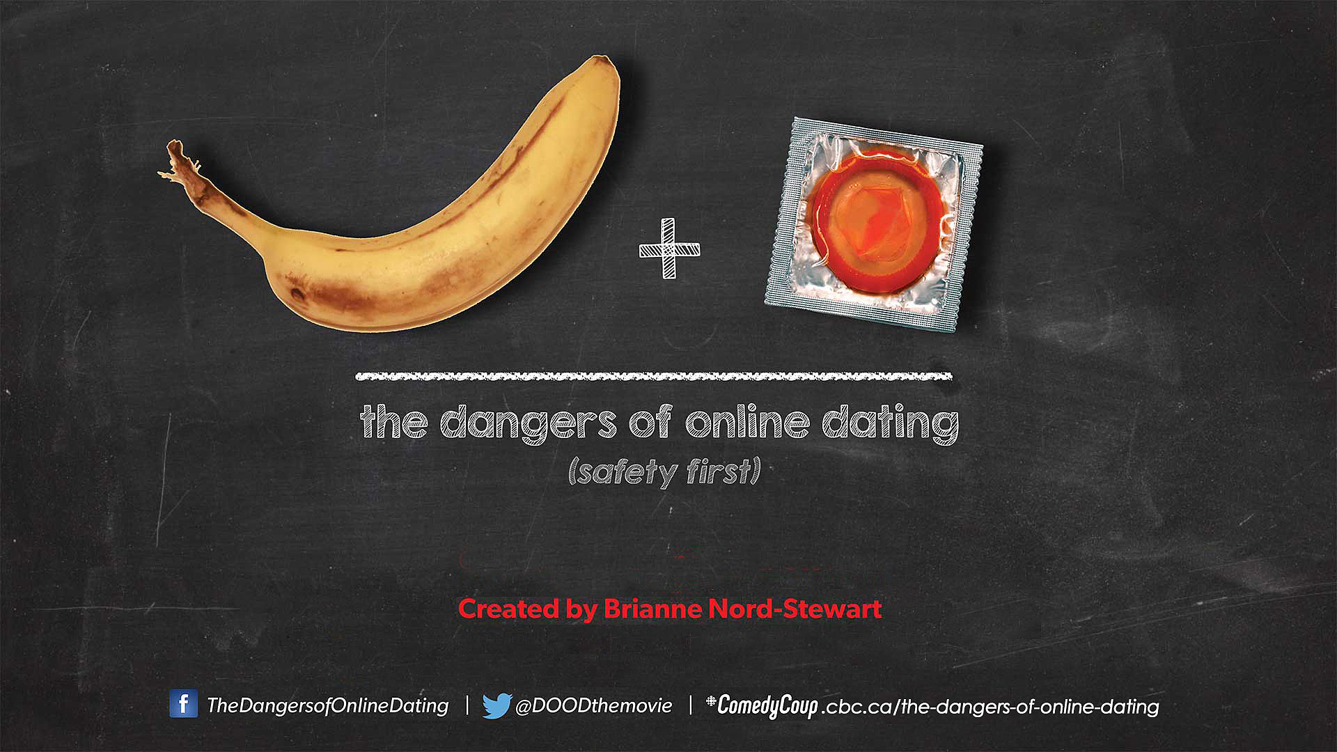
WE KNOW you love the redhead. We also know that anything remotely resembling a sexual innuendo is a hit. So we decided to stick to the basics. (We'd never shopped for bananas on the basis of shape before...) Paula works in an LGBTQ sexual health clinic, and teaches everyone else how to have sex – SAFETY FIRST! The irony? Paula is dealing with a sexual drought of her own. Seems staring at positive cases of chlamydia, syphilis, and herpes doesn't really make her want to get in the sack. I wonder why?
Fave 12
The posters are clear and to the point. Poster B has a lot more depth, in that there's a strong detail included, that supports the over all message. The diagrams on the board, the candy-stripper outfit, banana dressed in a condom, and then the condom package right on in the corner. Well made!


Comments (25)
Nurse Paula's smile really makes me want to find out what she is smiling about, and the poster gives good info.
Went with B.
Sorry, I am not keen on either image. Who might this appeal to on the broader market?
poster B, condoms are more fun with a hottie!
just never know, whats behind the banana?
picked B, poster A is well made but it makes it seem like the whole show is about teaching sex ed (which would be find, don't get me wrong, it's just leaving out half the show!)
Poster B, nothing better than the original
Poster B shows more of what the project is about. Has the principle character on it and establishes her role and a sneak peek of the humour we are in for.
Thanks Dylan, Glad you like it!
Poster B! Shout out to Byron Noble fellow Lucas Talent actor.
All the shout outs to Byron! He rules!
The posters are clear and to the point. Poster B has a lot more depth, in that there's a strong detail included, that supports the over all message. The diagrams on the board, the candy-stripper outfit, banana dressed in a condom, and then the condom package right on in the corner. Well made!
Excellent attention to detail!
There is nothing about poster B that I do not like. It illustrates perfectly what the show is about and Paula's sardonic smile tells the whole story.
You're the best Donal!
Nice work on the posters & additional images! Team Charlie & Yoni.
Thanks Jessica! Yours are looking good too!
I like the step by step instructions in the background (B)
Safety First !
Had to pick poster B, like seeing the nurse if you get into trouble, also congrats on making the top 55, looking forward to see what the weeks to come will bring
I'm going to go with poster B. I understand what you're going for in poster A, but the chalkboard background doesn't really relate to online dating in my opinion. Poster A I would have to say is more creative though since you've used your poster B material before, so it's really nothing new and not that original at all. However, I do find poster B relates more to your show and thus wins my vote, the white writing on the white background does make for difficult reading though. I really wish you guys had taken the time to really show your creative flare this time, it reminds me a lot of your last mission as well, since I found your last mission completely avoided the question and basically looked like material you had already previously produced at an earlier time.
Noted...
I love how you have incorporated the same elements in the new poster! I am a fan of the yellow one with all the people on it as well. More striking that the chalkboard one.
Thanks Sue Ann!
yes to B for sure! Its more subtle and fun
A little, subtle sassiness seems to be the way to go!
I picked poster B because it's a cute girl holding a banana with a condom on it.
I prefer Poster B. I think it connects more with the audience, reflects the project accurately, and has more readable text.
Thanks Mike!
Poster B has an absolutely fresh & alive feel to it. It speaks volumes in a fun, sassy and educational tone that grabs the viewers attention, peaks their curiosity and simply leaves them wanting (or needing) to know more more. Really captures the essence of what it's all about...great job!
Thanks Helen! We are suckers for a little sass!
It's true! If it ain't broke don't fix it. Paula is such a gorgeous gal that her suave smile catches my eye right away, and has since the very first week of Comedy Coup! Great job on all the posters, though!
You flatterer you!
great job on all of these posters. They are very eye catching and I think anyone that sees it will stop for a seconds just because of the fact there are condoms hehe. May not be the most appropriate for all viewers but cute either way.
I feel the original art work is ( Nurse Paula ) poster is strong. And although I read the efforts put together for an alternative, I agree with "if it ain't broke don't fix it". Scrolling down your page I saw the yellow concepts, and liked the "So many Fish in the Sea" poster too. Something stood out more for me in that than the chalkboard version. Good job all round, and keep it up girls! ( No pun intended! )
We like all the puns! Glad you checked out the extra options too!
I really thought you would come up with a more original poster. Looks like you didnt try at all.
Do you need a hug Franziska... or possibly a date to cheer you up. I heard of this great thing you can do online now.....
Wow. I think you might just be trying to down vote people.
Love it, LOVE IT!
Thoughts??
Report Comment
You are about to report a violation of our Terms of Use. All reports are strictly confidential.
We will NOT remove comments just because you disagree with the statement being made.
Reason for reporting*